
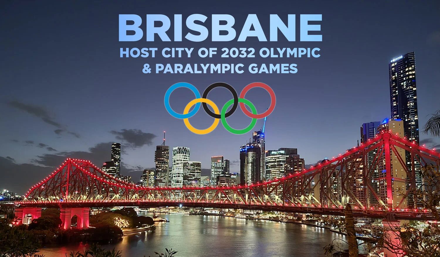
The New Broncos logo meaning has taken centre stage in one of the most discussed NRL identity shifts in recent years. Brisbane chose to overhaul its visual DNA at a moment when the club’s on-field credibility is sky-high and the city’s broader sporting profile is rising ahead of the 2032 Olympics. That combination makes the timing both strategic and risky.
Some fans argue the club should never touch a traditional emblem after winning. Others believe that success is exactly the moment to reset the story. Either way, the rebrand forces the league—and Brisbane’s rivals—to consider how clubs must evolve in a digital-first era.
Why the Rebrand Feels Bigger Than a Logo & New Broncos Logo Meaning — Editorial Insight Table
This redesign goes beyond a new crest. It reflects a shift in how the Broncos want to present themselves globally, regionally and culturally. The leaked IP images created a firestorm early, but they also revealed the strongest theme of the rebrand: intentional simplicity.
The move aligns with sports organisations that have embraced cleaner, adaptable marks. Juventus did it. Inter Miami did it. Even AFL clubs like Carlton and Fremantle have gone minimalist in recent years. Brisbane is simply joining that wave—just later than expected.
New Broncos Logo Meaning — Editorial Insight Table
| Design Decision | What It Suggests About the Club |
|---|---|
| Forward-facing horse | A club projecting power, assertiveness and readiness for global presentation. |
| Shield format | A return to classic sports symbolism — protection, pride and tradition. |
| Brisbane wordmark | A deliberate claim on city identity as competition for Queensland territory grows. |
| River line | A reminder that identity is geographically anchored, even as the brand modernises. |
| Minimalism | A club that wants to appear clean, confident and future-first. |
This isn’t just design—it’s positioning.
How the New Broncos Logo Meaning Shows Up in Jerseys, Messaging & Identity
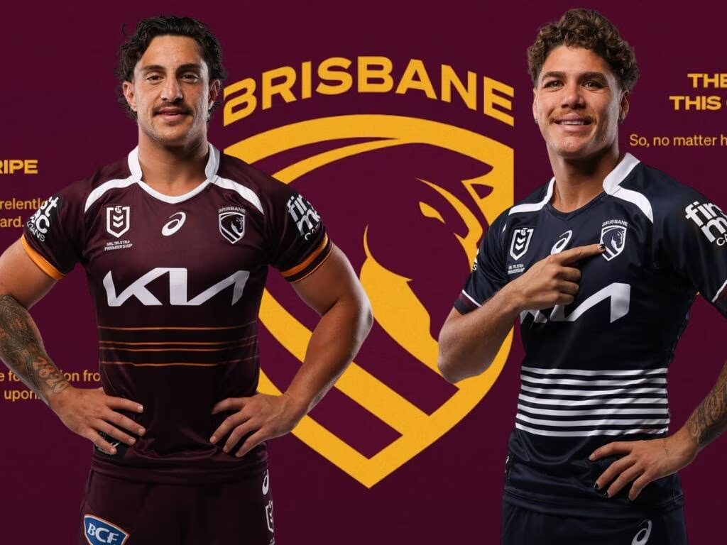
To understand the New Broncos logo meaning, it helps to look at how it functions across the 2026 jerseys. On fabric, the forward-facing horse is clearer and more assertive. The shield makes it easier to place the emblem in consistent positions, while the simplified geometry allows the logo to stand out even in rapid broadcast transitions.
What the Jerseys Tell Us
Brisbane made three deliberate stylistic moves:
- Cleaner maroon-gold home strip to reduce visual noise
- A navy Cyril Connell tribute jersey that respects Queensland rugby league heritage
- Threaded heritage accents that soften the leap into minimalism
These choices reflect a club trying to bridge fan memory with future direction—never a simple task.
The Mantra That Holds It Together
“We Charge On” is more than a tagline. It’s the club’s attempt to assert control over the narrative. It tells supporters: this is evolution, not abandonment. And it tells players: success isn’t a resting point.
It also functions as a reassurance—because rebrands often need one.
Fan Debate, Media Reaction & the Cultural Undertone Behind It All – New Broncos logo meaning
This rebrand may not be the most controversial in sports, but it taps into familiar tensions: heritage versus modernity, regional identity versus global ambition, emotion versus practicality.
Supporters Who Embrace the Change:
- Younger fans used to international sports branding
- Design-minded supporters drawn to minimal marks
- Those who see strategic benefit in aligning with the 2032 Olympics
Supporters Who Resist the Change:
- Traditionalists who view the original horse as sacred
- Older fans who believe typography shouldn’t replace team identity
- People who see minimalism as corporate, not cultural
Interestingly, many of the strongest criticisms echo reactions from other sporting rebrands. When Man City modernised, the backlash was fierce. When the Warriors updated their logo, longtime fans were divided. Time tends to soften resistance—though not always.
The reported $300,000 design cost only fuelled the commentary, but big clubs rarely measure such projects in one-year returns. Identity is a long-term investment.
Conclusion: A Risky, Necessary, and Ultimately Forward-Facing Statement
The Broncos’ 2026 identity shift won’t please everyone—no major rebrand ever does. But it does achieve something important: it clarifies who the Broncos want to be in a decade marked by the Olympics, digital expansion and heightened competition within Queensland.
The simplified crest, rebalanced jerseys and “We Charge On” mantra work as one statement. They tell the league that Brisbane is choosing evolution over preservation and positioning itself for relevance beyond the domestic rugby league bubble.
Whether fans love it, hate it, or slowly grow into it, the New Broncos logo meaning is unmistakably clear: Brisbane is charging toward the future, not away from its past.


